
Machine learning is the buzzword of the moment, so I wanted to talk about that sweet ML here too.
For a project that I’m working on, I’ve been experimenting on basic ML prediction algorithms, in this instance I’ll show you a basic POC on how ML can be integrated right into PowerBI in a serviceable manner.
The data
I just needed some whatever data to build my model on, I chose to get the filesize history of my backupsets in msdb, this is all the data I have:
SELECT CONVERT(date,BS.backup_finish_date) BackupDate, BF.physical_name FileName, MAX(BF.file_size) / 1000000 [FileSize (MB)], BF.physical_drive as PhisicalDrive
  FROM [msdb].[dbo].[backupset] BS
  JOIN msdb.dbo.backupfile BF ON BF.backup_set_id = BS.backup_set_id
GROUP BY CONVERT(date,BS.backup_finish_date), BF.physical_name, BF.physical_drive
ORDER BY BackupDate, physical_name
The data comes from SQL Server in this case, but since we’ll be working directly with the data in PowerBI, the source can be anything that PowerBI can fetch from, which is A LOT.
I’m focusing on only one Phisical Drive in order to not overly complicate the demo, so, if you have more that one, you can simply filter the one you need on a report level directly in PowerBI.
The Model
For my particular dataset, as I know how the databases are used, I chose to apply a linear regression model to the data, since that’s the one that should approximate best my particular set of data. The choice of the ML model to apply to your dataset it’s a whole another science itself; this post is about how to integrate the technology, you can use Azure ML Studio to play with models in a safe and fast environment.
The Preparation
As a prerequisite, of course, you’ll need to have python installed in your machine, I recommend having an external IDE like Visual Studio Code to write your Python code as the PowerBI window offers zero assistance to coding.
You can follow this article in order to configure Python Correctly for PowerBI.
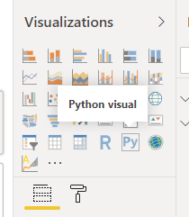
Step 2 is to add a Python Visual to the page, and let the magic happen.
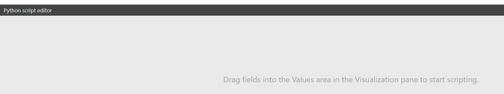
A new pane will open in the bottom part of the window, prompting you to drag into the values pane of the visual the fields that you want to expose to the script:
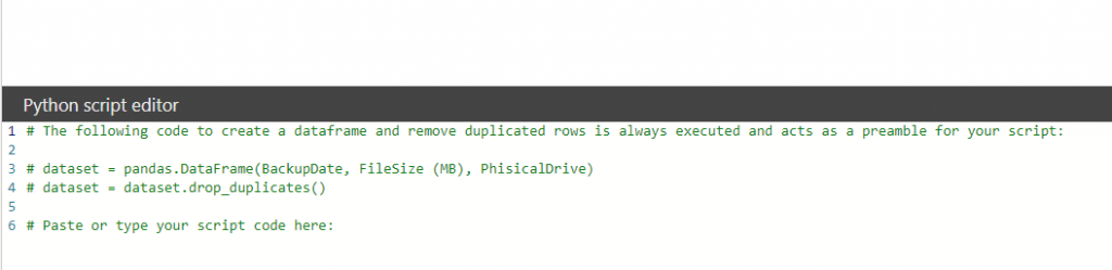
For this demo, drag BackupDate, Filesize (MB) and PhisicalDrive, the visual will create a starting snippet and you’ll be ready to start coding from here:
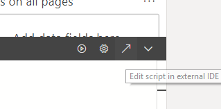
Now, my recommendation is to click on the upward arrow in the right corner of the pane in order to open and run the code in a decent editor before going back to PowerBI.
The report is actually composed of two Python visuals, one with the graph, and the other one displaying the text; I used a workaround for the latter, as you cannot return text to display back to PowerBI from Python, at least at the moment.
The Graph
In order for PowerBI to show anything, we have to build and display a figure; I’m using sklerarn, matplotlib and pandas to archive this result.
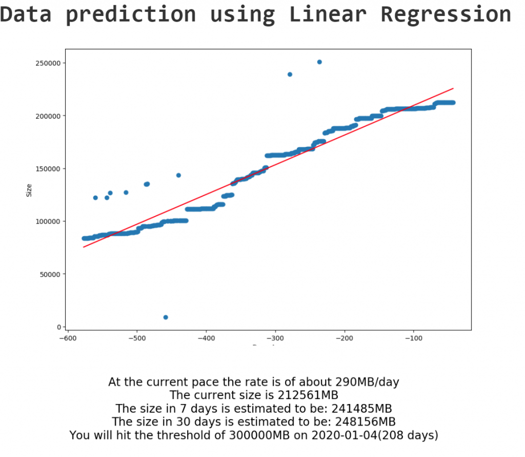
The idea is to shape the time axis in such a way that “0” is always today, so that all the history has a negative “X” value, while all the predictions have positive values, like a sliding window always centered on today.
Once that the X axis has been transformed in this way, the data can be fed to the linear model for training; the result of a trained linear model is a linear equation that describes a line (i.e. y = ax + b), we’ll need the coefficient (a) and intercept (b) in order to calculate our prediction, or, in this case, to draw the red line over the graph that shows the calculated linear equation.
# Prolog - Auto Generated #
import os, uuid, matplotlib
matplotlib.use('Agg')
import matplotlib.pyplot
import pandas

os.chdir(u'C:/Users/Menny/PythonEditorWrapper_59b0a1de-d5a9-4df4-813e-caf99b0d9e8e')
dataset = pandas.read_csv('input_df_4c773508-a108-4112-80f6-8f7318daff1b.csv')

matplotlib.pyplot.figure(figsize=(5.55555555555556,4.16666666666667))
matplotlib.pyplot.show = lambda args=None,kw=None: matplotlib.pyplot.savefig(str(uuid.uuid1()))
# Original Script. Please update your script content here and once completed copy below section back to the original editing window #
from sklearn import linear_model
from datetime import date, datetime, timedelta
from sklearn.model_selection import cross_val_score, train_test_split
import matplotlib.pyplot as plt

# Calculate the delta
dataset['DeltaDays'] = (pandas.to_datetime(dataset['BackupDate']) - datetime.today()).dt.days


# Assign the appropriate columns
X = dataset['DeltaDays'].values.reshape(-1,1)
y = dataset['FileSize (MB)'].values

# Train test split
X_train, X_test, y_train, y_test = train_test_split(X, y, test_size=0.6)

# Fit a linear regression model
lm = linear_model.LinearRegression()
lm.fit(X_train, y_train)

plt.plot(X, y, 'o')
plt.plot(X, lm.coef_ * X + lm.intercept_, '-', color='red', label='Trend')
plt.xlabel('Days Ago')
plt.ylabel('Size')
plt.show()


# Epilog - Auto Generated #
os.chdir(u'C:/Users/Menny/PythonEditorWrapper_59b0a1de-d5a9-4df4-813e-caf99b0d9e8e')
The Prediction
As mentioned above, in order to show the predictions in PowerBI as text I had to improvise by creating a figure with the text and then displaying it as if it were a graph; PowerBI just displays what it gets, so as long as you make sure to match the font of the report with the fonts in the figure nobody will be ever able to discover our secret.
Calculating the prediction it’s easy, once we have the trained model, a linear function is easy to work with and you can calculate whatever value and interception point with basic math; Since the X axis is defined as an integer interval centered on today’s date, this is even easier.
I’ve added a user-generated table in the PowerBI model that only contains a threshold value, in order to calculate in how many days that threshold will be reached; of course this threshold could be calculated dynamically based on the conditions that you need and the prediction would be updated accordingly, but this is just a POC.
The main difference from the Graph paragraph is that I calculate the various intercept points of interest (7, 30 days and threshold intercept), create a series of strings with the information, concatenate it and plot the text on an empty graph:
# Prolog - Auto Generated #
import os, uuid, matplotlib
matplotlib.use('Agg')
import matplotlib.pyplot
import pandas

os.chdir(u'C:/Users/Menny/PythonEditorWrapper_d5c7e6b8-2ff1-4cc8-9da5-86da8aa75eb6')
dataset = pandas.read_csv('input_df_46b3e2a0-d104-4077-a608-993b2c7b077a.csv')

matplotlib.pyplot.figure(figsize=(5.55555555555556,4.16666666666667))
matplotlib.pyplot.show = lambda args=None,kw=None: matplotlib.pyplot.savefig(str(uuid.uuid1()))
# Original Script. Please update your script content here and once completed copy below section back to the original editing window #
from sklearn import linear_model
from datetime import date, datetime, timedelta
from sklearn.model_selection import cross_val_score, train_test_split
import matplotlib.pyplot as plt

# Calculate the delta
dataset['DeltaDays'] = (pandas.to_datetime(dataset['BackupDate']) - datetime.today()).dt.days

# Assign the appropriate columns
X = dataset['DeltaDays'].values.reshape(-1,1)
y = dataset['FileSize (MB)'].values

# Train test split
X_train, X_test, y_train, y_test = train_test_split(X, y, test_size=0.2)

# Fit a linear regression model
lm = linear_model.LinearRegression()
lm.fit(X_train, y_train)

sizeIn7days = lm.intercept_ + (lm.coef_[0] * 7)
sizeIn30days = lm.intercept_ + (lm.coef_ * 30)
daysUntilThreshold = (dataset['Size'][0] - lm.intercept_ ) / lm.coef_
thresholdDate = date.today() + timedelta(daysUntilThreshold[0])

TextRate = "At the current pace the rate is of about " + str(int(lm.coef_)) + "MB/day"
Text0 = "The current size is " + str(int(y[-1])) + 'MB'
Text7 = "The size in 7 days is estimated to be: " + str(int(sizeIn7days)) + 'MB'
Text30 = "The size in 30 days is estimated to be: " + str(int(sizeIn30days)) + 'MB'
TextThreshold = "You will hit the threshold of " + str(dataset['Size'][0]) + "MB on "  + str(thresholdDate) + "(" + str(int(daysUntilThreshold)) + " days)"

TextBox = TextRate + '\n' + Text0 + '\n' + Text7 + '\n' + Text30 + '\n' + TextThreshold

matplotlib.pyplot.axis('off')
matplotlib.pyplot.text(0.5, 0.5, TextBox, ha='center', va='center', size=20)

matplotlib.pyplot.show()

# Epilog - Auto Generated #
os.chdir(u'C:/Users/Menny/PythonEditorWrapper_d5c7e6b8-2ff1-4cc8-9da5-86da8aa75eb6')
Takeaways
You may have noticed that I had to train the model twice, as the two visuals do not comunicate in any way, which is a shame, especially for bigger models.
Moreover, Pyhton on PowerBI still has the following limitations:
- You can use the Python plot for maximum 150,000 rows in the data set
- You cannot prepare an interactive image with it
- Python script will give a time out error after 5 minutes of execution
- Python plot cannot be used for cross filtering
So, it’s not perfect, you cannot pretend to do real big data ML with Python in this way (you can still do in hundreds of ways and then import the results in PowerBI, still), but it’s a nice feature to have for quickly deployable reports with that touch of ML magic.
[…] Emanuele Meazzo builds a linear regression in Power BI using a Python visual: […]
Hello, it’s an amazing artcule. I have several issue with the skilearn library with Win10. I ended up using anaconda and setting the vscode to use that interpreter. Now I’m trying to use it on Power BI.
Thanks for sharing,
Regards from the other side of the globe (Uruguay),
Felipe Schneider
Thanks Felipe!
Glad you enjoyed it 🙂